Charm Hoops
For this project, I developed a visual identity that reflects the playful modularity of the product. Mixing bold, round type with more delicate, mostly angular sans serif. From digital assets to packaging, each piece was designed to feel collectible, expressive, and effortlessly customizable — just like the hoops themselves.
Mailing Collateral was developed to be included in orders Charm Hoops, to encourage return customers.
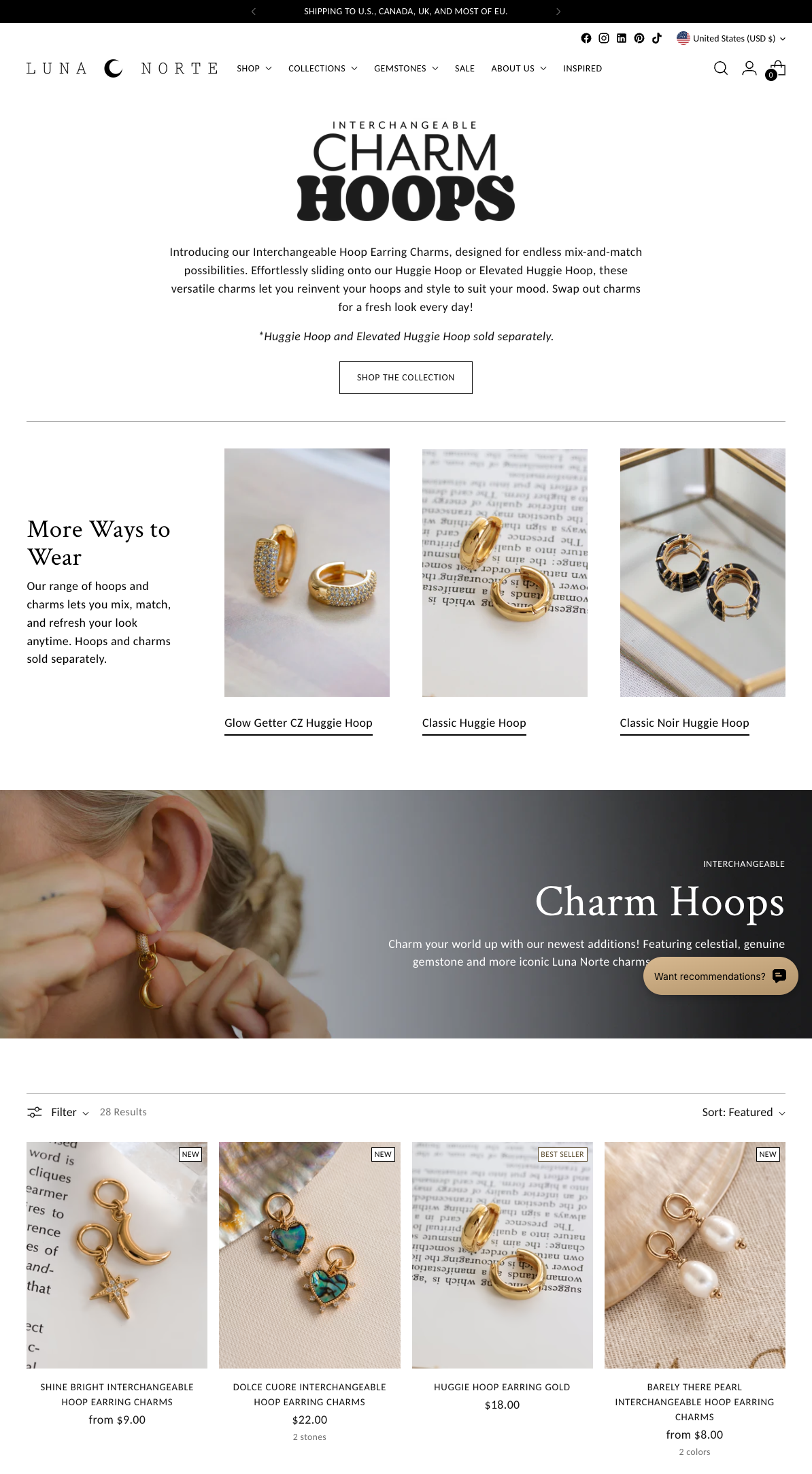
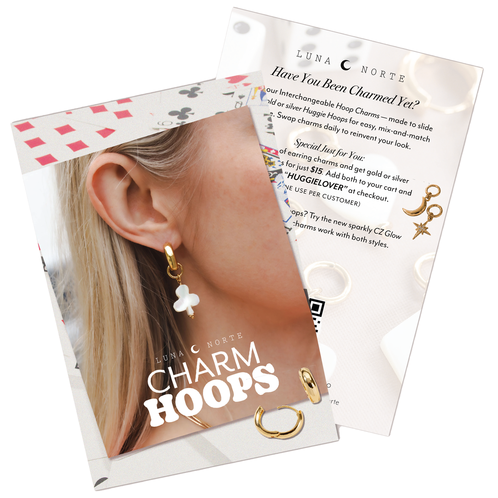
web design, mailing collateral
Charm Hoops Packaging
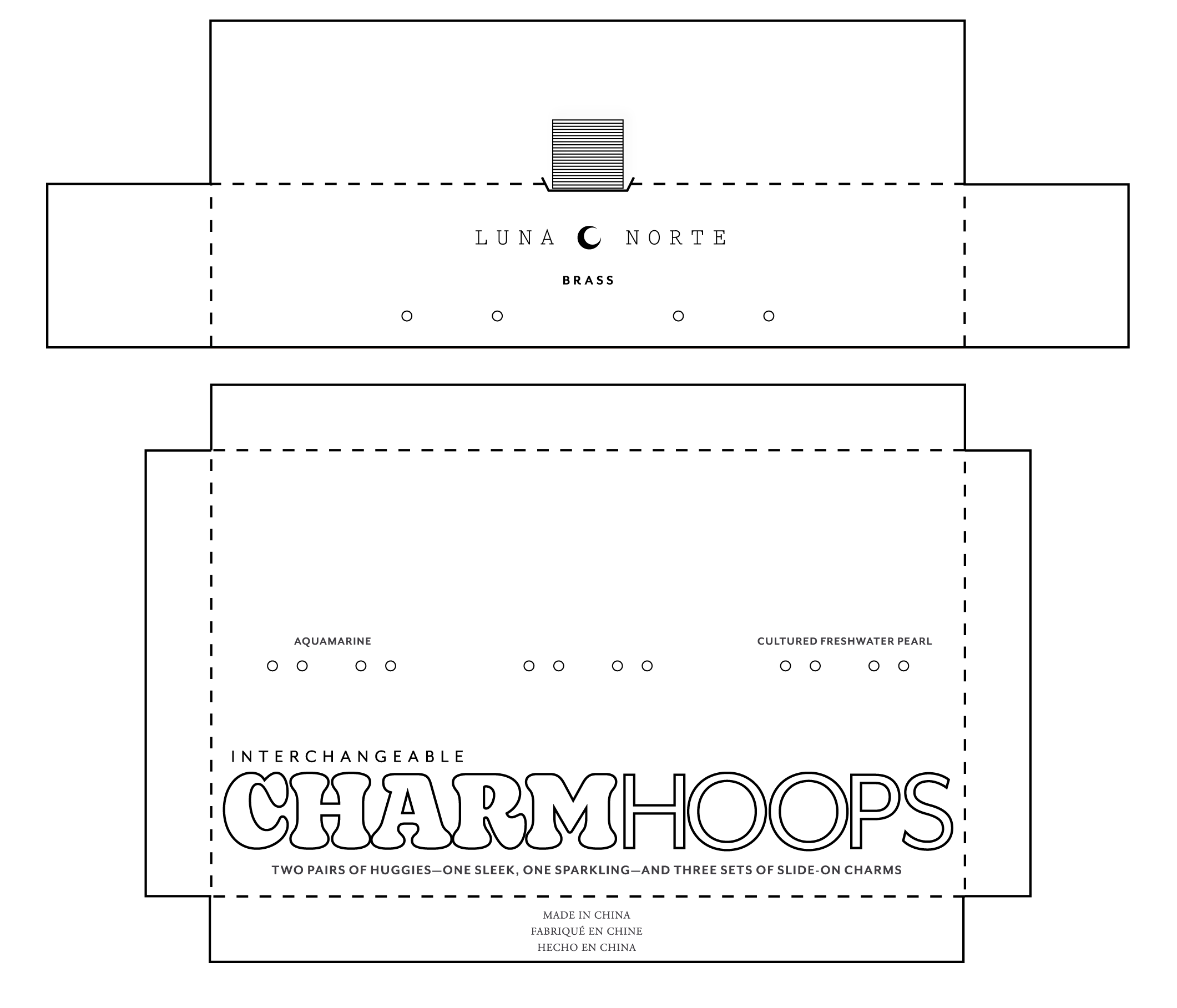
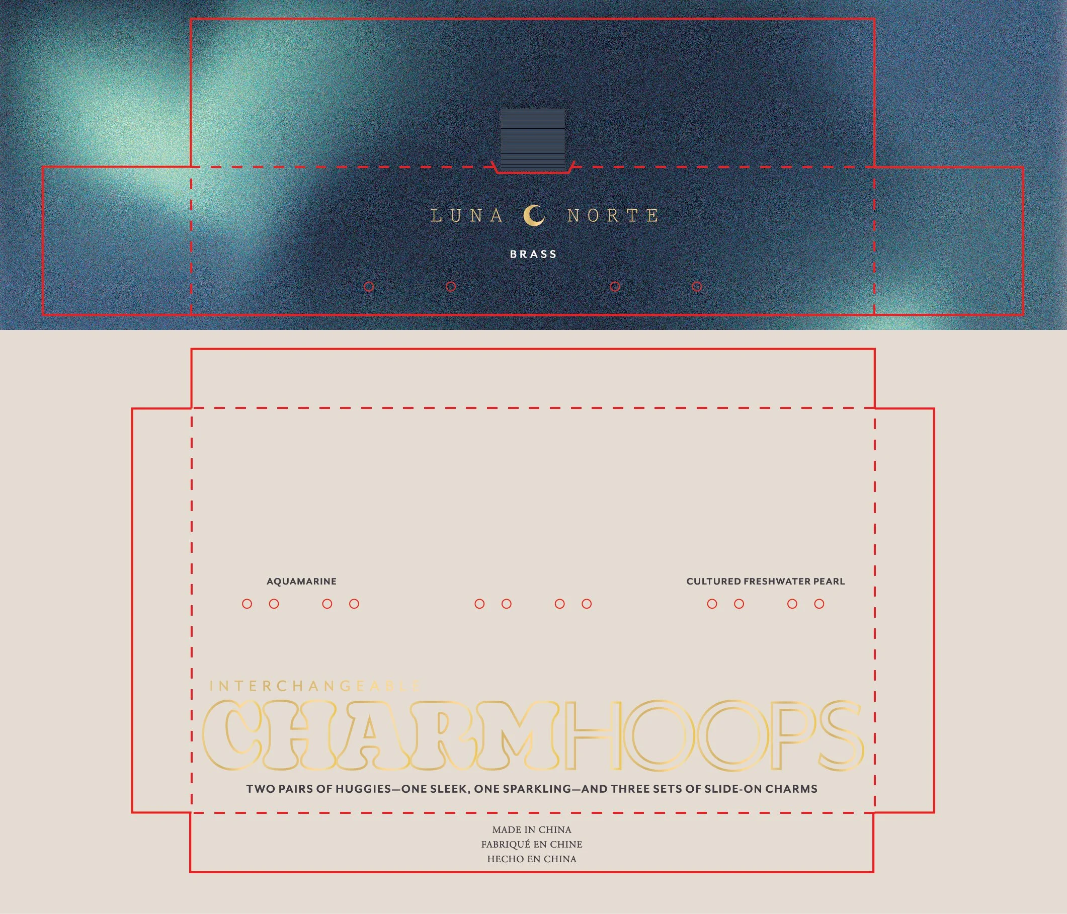
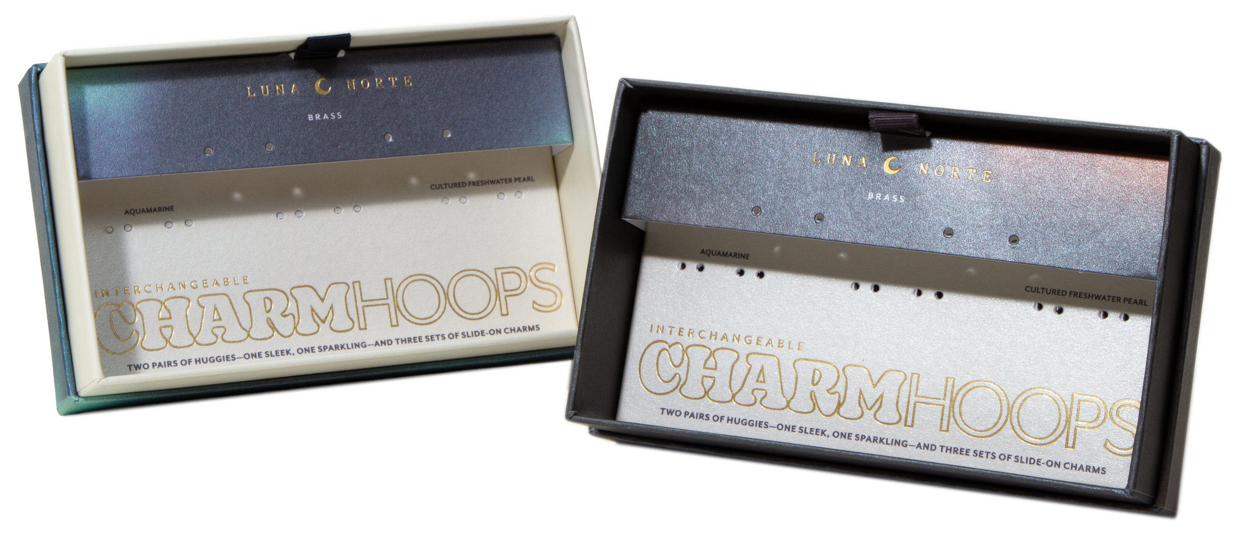
A split-level structure puts the spotlight on the pairs of hoops up top, while the lower deck stores a collection of three sets of various gemstone charms.
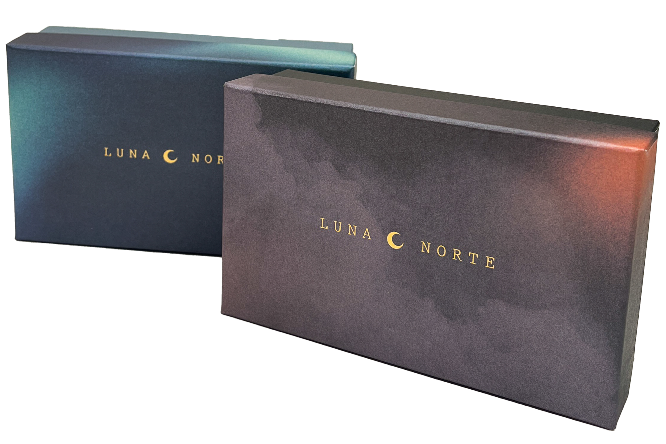
Both tiers are accented by gold foil text and pearlescent paper. The lid is wrapped in a custom Northern Lights-esque gradient that matches the interior upper insert, while the bottom of the box is a creamy off-white that matches the lower insert, respectively.
For Halloween, I conjured up something extra special: a limited-edition box cloaked in a moody midnight sky with subtle washes of orange light illuminating the print.
packaging design