Charm Hoops
#charmhoops_marketing
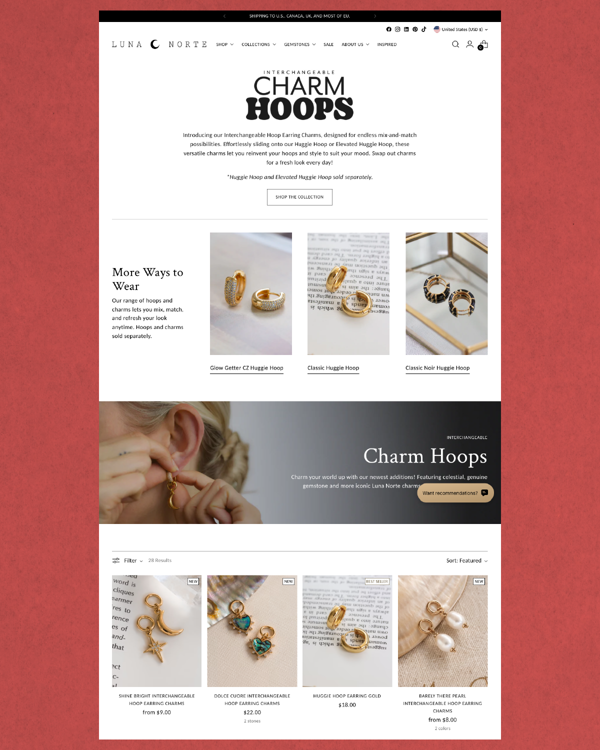
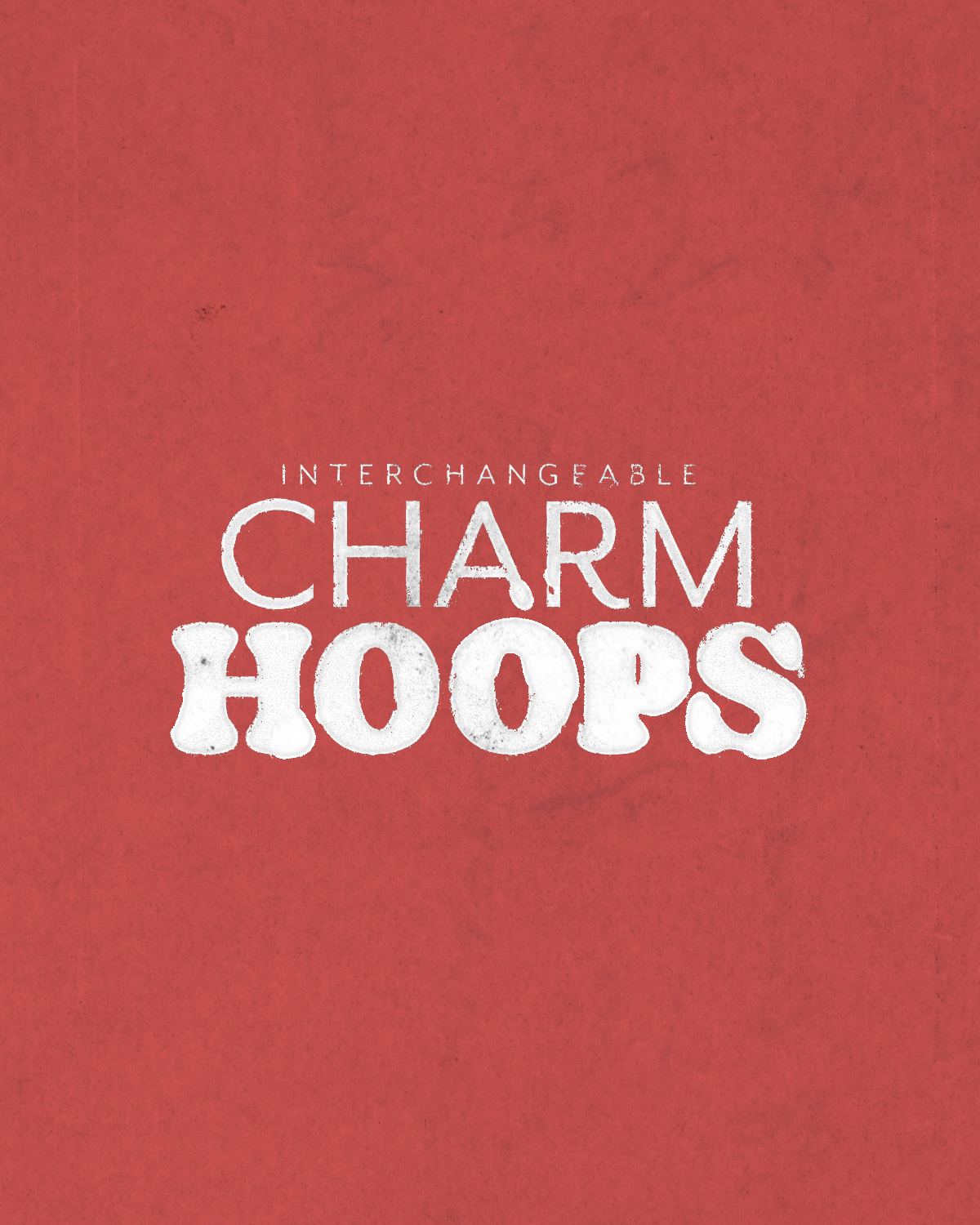
For this project, I developed a visual identity that reflects the playful modularity of the product. Pairing the playful, bold, & rounder type with the thinner sans serif, “Mr. Eaves Sans” opposed to the more modern version of the typeface. From digital assets to packaging, each piece was designed to feel singular & expressive.
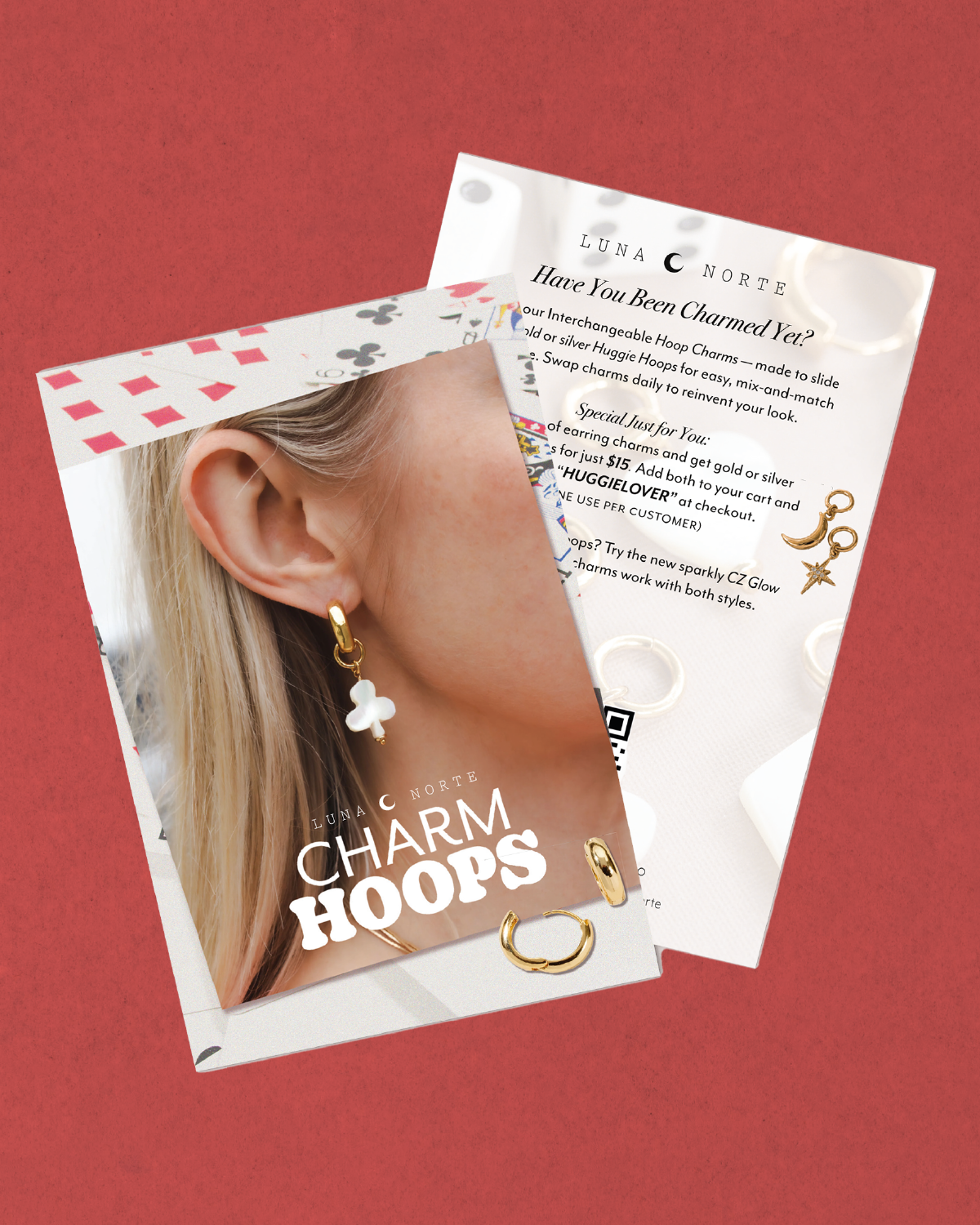
Mailing Collateral was developed to be included in orders that include Charm Hoops, to encourage return customers.
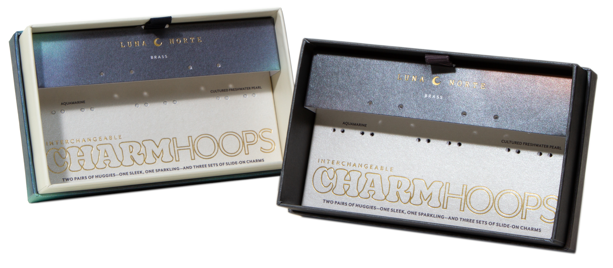
#charmhoops_packaging
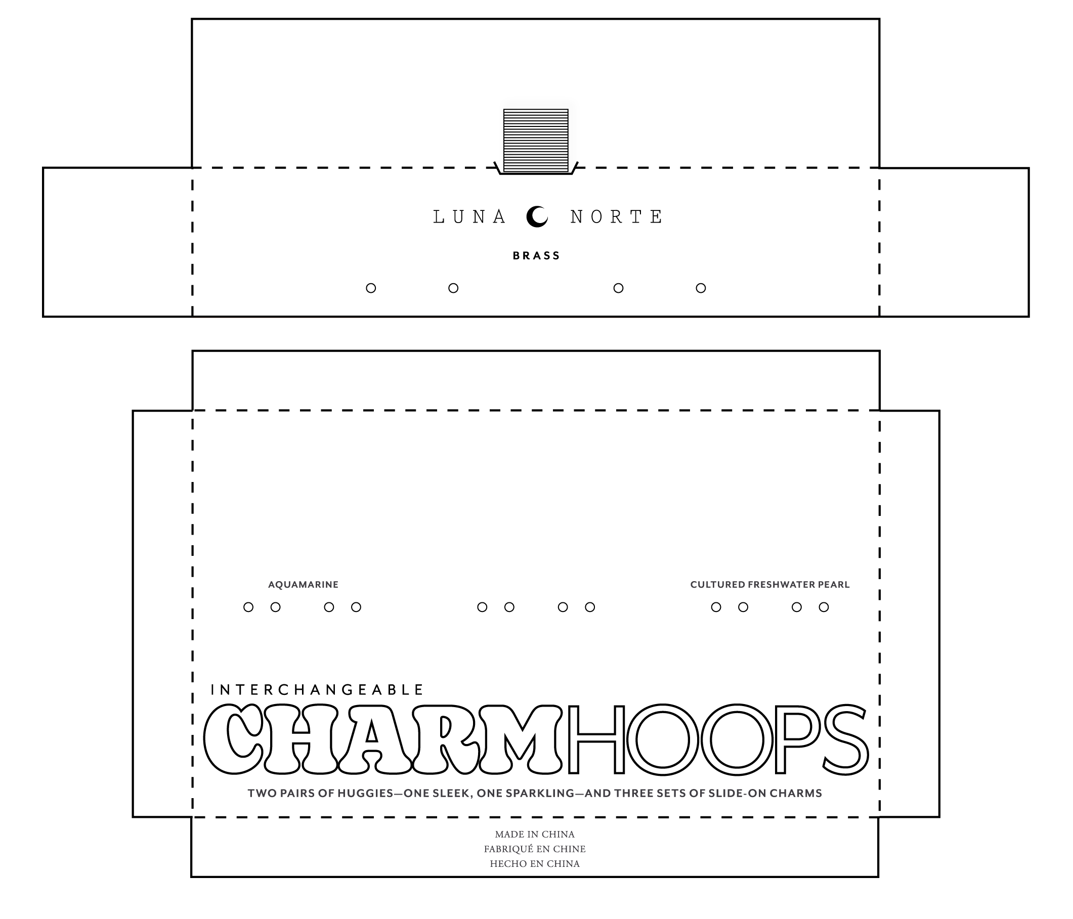
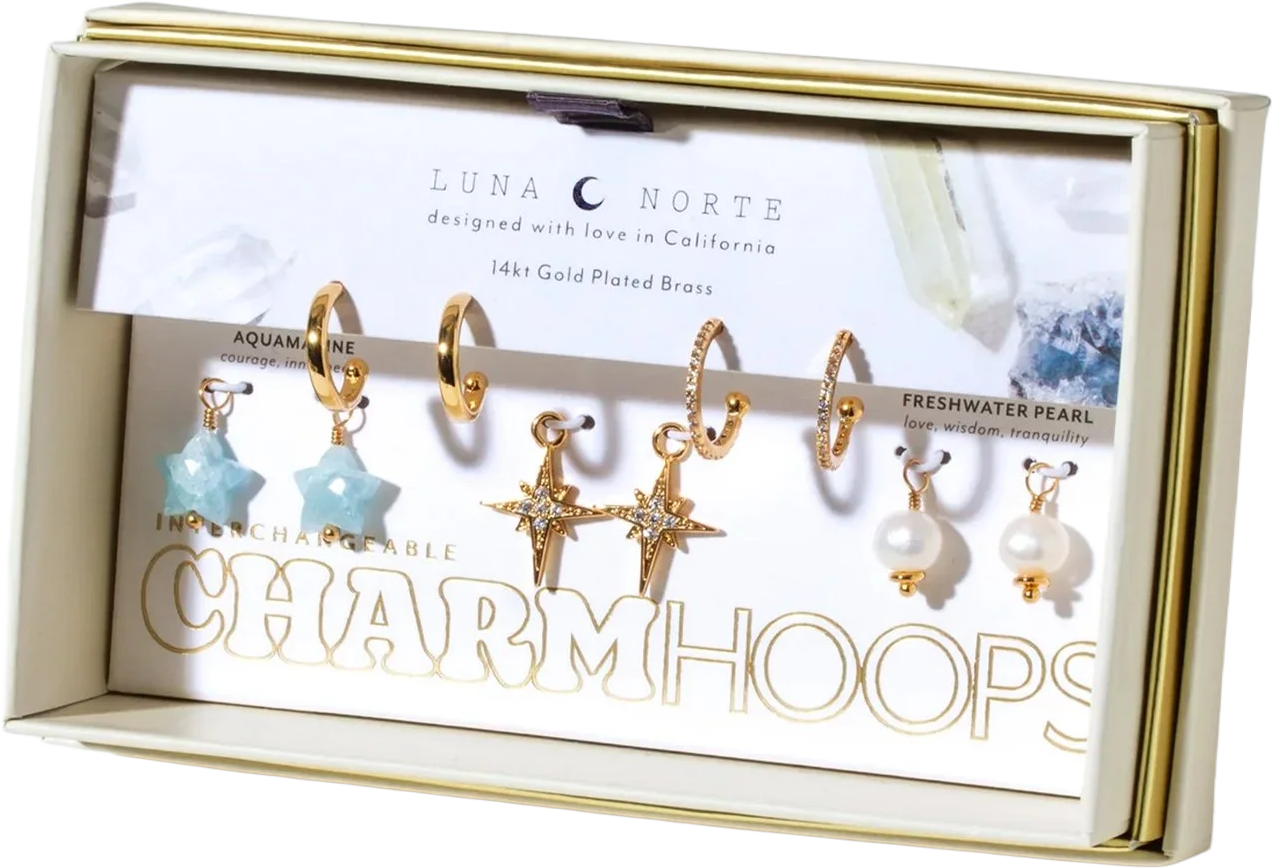
A split-level structure ensures the most efficent placement for different sized hoops and varriying quanities of charms.
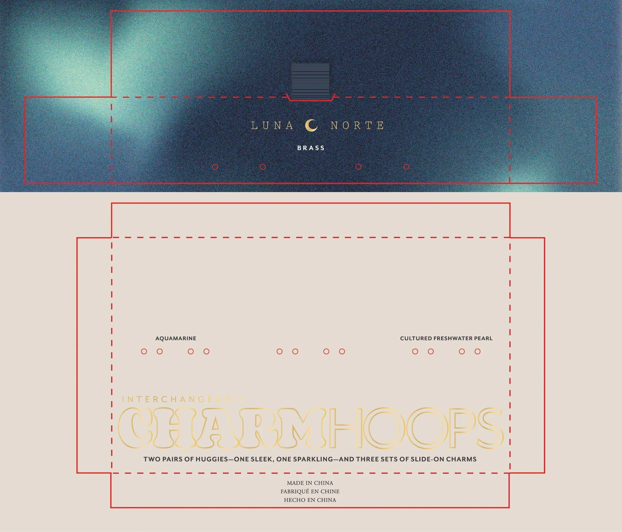
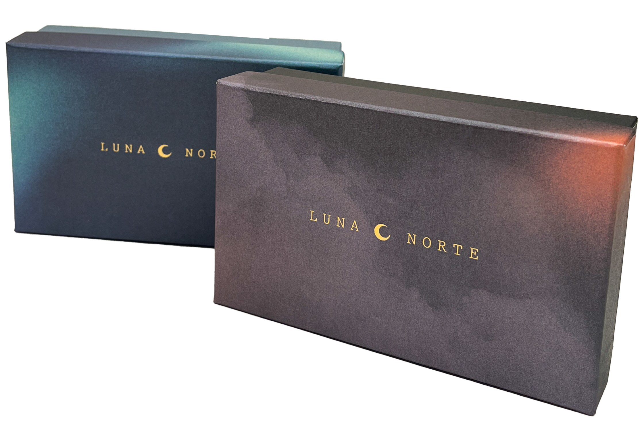
Both tiers are accented by gold foil text and pearlescent paper. The lid and upper insert are wrapped in a custom Northern Lights-esque gradient, while the bottom of the box is a creamy off-white that matches the lower insert, respectively. In boutique applications we offer a simplified off white version with metaphysical crystal imagery.